Tri-Tone Letterpress Portrait
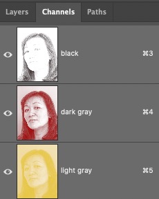
Ink simulation in Photoshop

This is a screenshot from Illustrator. These are MDF plates. From left to right, black, red, and yellow. Solid black regions inside the image frame are un-lased areas to be hand carved later to save on the fume extraction consumables (to lessen the smoke generation). You can see some areas were cut off to make holes instead of having to carve them out by hand later (You can see that around 1:40 into the YouTube linked above).

Thin lined arrows indicate 8 quoins holding the plate in its place while maintaining easy registration adjustment.
Thick lined arrow indicates one of the void holes so to skip hand carving. Light tanned colored regions are hand carved areas. We avoided voiding large areas to maintain the structural integrity while being “screwed on” by screws. But definitely we could’ve put some holes in there to lessen the hand carving time (circles).

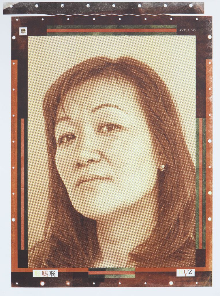
Tri-Tone letterpress portrait pressed using our Vandercook 232P proof-Tess.
#letterpressPortraits